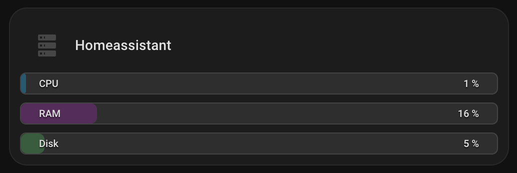
Ich war auch auf der Suche nach einer guten Bar card.Da es nichts mehr gab, habe ich mir selbst aus custom button cards etwas gebaut.
Hier der YAML code:
type: custom:vertical-stack-in-card
cards:
  - type: horizontal-stack
    cards:
      - type: custom:mushroom-template-card
        primary: Homeassistant
        secondary: null
        icon: mdi:server
        color: disabled
        tap_action:
          action: none
        features_position: bottom
        card_mod:
          style: |
            ha-card {
              background: transparent !important;
              box-shadow: none !important;
              border: none !important;
              padding: 0 !important;
            }
  - type: vertical-stack
    cards:
      - type: custom:button-card
        entity: sensor.processor_use
        show_icon: false
        show_name: false
        show_state: false
        tap_action:
          action: more-info
        custom_fields:
          bar: |
            [[[
              const v = parseFloat(entity.state) || 0;
              const p = Math.min(100, Math.max(0, v));

              const fill =
                (p > 85) ? 'rgba(244,67,54,0.45)' :
                (p > 65) ? 'rgba(255,152,0,0.45)' :
                           'rgba(3,169,244,0.35)';

              return `<div style="
                position:absolute;left:0;top:0;bottom:0;
                width:${p}%;
                background:${fill};
                border-radius:6px;
              "></div>`;
            ]]]
          left: CPU
          right: "[[[ return `${Math.round(parseFloat(entity.state)||0)} %`; ]]]"
        styles:
          card:
            - height: 22px
            - font-size: 10px
            - padding: 0 8px
            - border-radius: 6px
            - overflow: hidden
            - position: relative
            - background: rgba(125,125,125,0.18)
            - box-shadow: none
          grid:
            - grid-template-areas: "\"left right\""
            - grid-template-columns: 1fr auto
            - align-items: center
          custom_fields:
            bar:
              - position: absolute
              - inset: 0
              - z-index: 0
            left:
              - z-index: 1
              - justify-self: start
              - font-weight: 500
              - padding: 2px 10px
              - border-radius: 999px
              - color: var(--primary-text-color)
              - text-shadow: 0 1px 1px rgba(0,0,0,0.75)
            right:
              - z-index: 1
              - justify-self: end
              - font-weight: 500
              - padding: 2px 10px
              - border-radius: 999px
              - color: var(--primary-text-color)
              - text-shadow: 0 1px 1px rgba(0,0,0,0.75)
      - type: custom:button-card
        entity: sensor.memory_use_percent
        show_icon: false
        show_name: false
        show_state: false
        tap_action:
          action: more-info
        custom_fields:
          bar: |
            [[[
              const v = parseFloat(entity.state) || 0;
              const p = Math.min(100, Math.max(0, v));

              const fill =
                (p > 85) ? 'rgba(244,67,54,0.45)' :
                (p > 65) ? 'rgba(255,152,0,0.45)' :
                           'rgba(156,39,176,0.35)';

              return `<div style="
                position:absolute;left:0;top:0;bottom:0;
                width:${p}%;
                background:${fill};
                border-radius:6px;
              "></div>`;
            ]]]
          left: RAM
          right: "[[[ return `${Math.round(parseFloat(entity.state)||0)} %`; ]]]"
        styles:
          card:
            - height: 22px
            - font-size: 10px
            - padding: 0 8px
            - border-radius: 6px
            - overflow: hidden
            - position: relative
            - background: rgba(125,125,125,0.18)
            - box-shadow: none
          grid:
            - grid-template-areas: "\"left right\""
            - grid-template-columns: 1fr auto
            - align-items: center
          custom_fields:
            bar:
              - position: absolute
              - inset: 0
              - z-index: 0
            left:
              - z-index: 1
              - justify-self: start
              - font-weight: 500
              - padding: 2px 10px
              - border-radius: 999px
              - color: var(--primary-text-color)
              - text-shadow: 0 1px 1px rgba(0,0,0,0.75)
            right:
              - z-index: 1
              - justify-self: end
              - font-weight: 500
              - padding: 2px 10px
              - border-radius: 999px
              - color: var(--primary-text-color)
              - text-shadow: 0 1px 1px rgba(0,0,0,0.75)
      - type: custom:button-card
        entity: sensor.disk_use_percent_home
        show_icon: false
        show_name: false
        show_state: false
        tap_action:
          action: more-info
        custom_fields:
          bar: |
            [[[
              const v = parseFloat(entity.state) || 0;
              const p = Math.min(100, Math.max(0, v));

              const fill =
                (p > 90) ? 'rgba(244,67,54,0.45)' :
                (p > 75) ? 'rgba(255,152,0,0.45)' :
                           'rgba(76,175,80,0.35)';

              return `<div style="
                position:absolute;left:0;top:0;bottom:0;
                width:${p}%;
                background:${fill};
                border-radius:6px;
              "></div>`;
            ]]]
          left: Disk
          right: "[[[ return `${Math.round(parseFloat(entity.state)||0)} %`; ]]]"
        styles:
          card:
            - height: 22px
            - font-size: 10px
            - padding: 0 8px
            - border-radius: 6px
            - overflow: hidden
            - position: relative
            - background: rgba(125,125,125,0.18)
            - box-shadow: none
          grid:
            - grid-template-areas: "\"left right\""
            - grid-template-columns: 1fr auto
            - align-items: center
          custom_fields:
            bar:
              - position: absolute
              - inset: 0
              - z-index: 0
            left:
              - z-index: 1
              - justify-self: start
              - font-weight: 500
              - padding: 2px 10px
              - border-radius: 999px
              - color: var(--primary-text-color)
              - text-shadow: 0 1px 1px rgba(0,0,0,0.75)
            right:
              - z-index: 1
              - justify-self: end
              - font-weight: 500
              - padding: 2px 10px
              - border-radius: 999px
              - color: var(--primary-text-color)
              - text-shadow: 0 1px 1px rgba(0,0,0,0.75)
card_mod:
  style: |
    ha-card {
      {% set cpu  = states('sensor.processor_use') | float(0) %}
      {% set ram  = states('sensor.memory_use_percent') | float(0) %}
      {% set disk = states('sensor.disk_use_percent_home') | float(0) %}

      {% set warn = cpu > 65 or ram > 65 or disk > 75 %}
      {% set crit = cpu > 85 or ram > 85 or disk > 90 %}

      padding: 10px !important;

      {% if crit %}
        background: rgba(var(--rgb-error-color), 0.14) !important;
        border: 1px solid rgba(var(--rgb-error-color), 0.6) !important;
      {% elif warn %}
        background: rgba(var(--rgb-warning-color), 0.14) !important;
        border: 1px solid rgba(var(--rgb-warning-color), 0.5) !important;
      {% else %}
        background: var(--ha-card-background, var(--card-background-color)) !important;
        border: 1px solid rgba(255,255,255,0.06) !important;
      {% endif %}

      border-radius: 18px !important;
    }
    #root { gap: 10px; }
 .
.
 .
.