mosmax
1
Hallo zusammen,
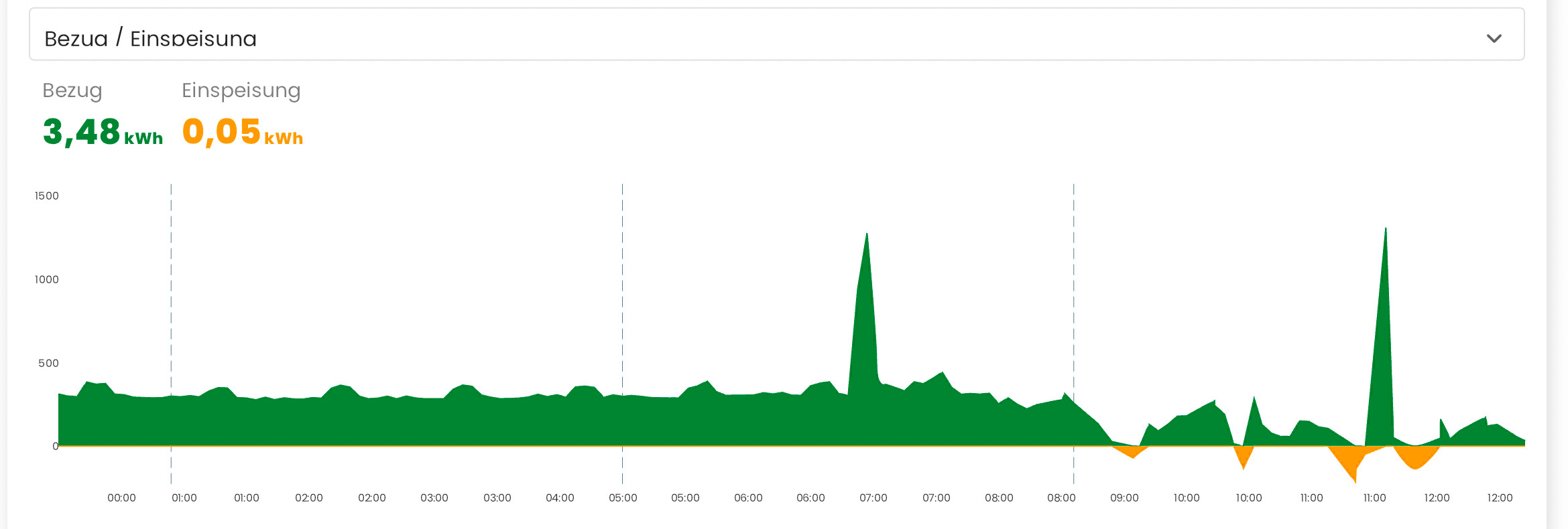
ich versuche geradein HA diese Karte im Dashboard nachzubauen von zaehlerfreunde:
ich habe eine. Shelly 3EM umd in der configuration.yaml die Summierung eingetragen, siht dann so asus:
Wochenende bekomme ich diese so schön hin wie die oben genannte und auch so, dass ich die im Dashboar einbauen kann?
Schau dir mal die “Lovelace Mini Graph Card” (aus HACS) an.
Das könnte dir vielleicht weiter helfen.
EiderHA
3
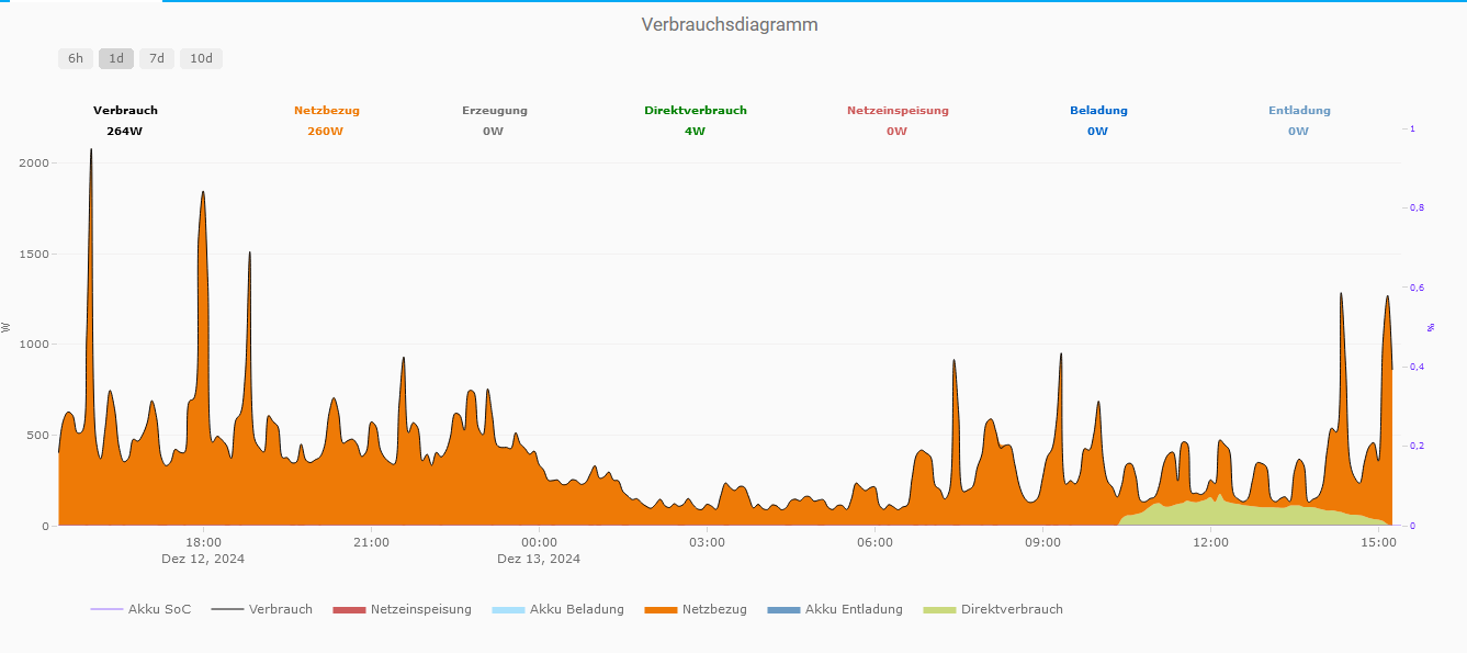
Moin,
ich bevorzuge für derartige Diagramme die Plotly Graph Card aus den HACS.
MeineDiagramm sieht so aus:
und hier ist der Code:
type: custom:plotly-graph
entities:
  - entity: sensor.direktverbrauch
    filters:
      - map_y_numbers: Math.round(Number(y))
    name: Direktverbrauch
    type: scatter
    mode: lines
    statistic: mean
    period: 5minute
    fillcolor: rgba(202,217,125,1)
    stackgroup: b
    line:
      shape: spline
      color: "#CAD97D"
      width: 0
  - entity: sensor.akku_entladung
    filters:
      - map_y_numbers: Math.round(Number(y))
    name: Akku Entladung
    type: scatter
    mode: lines
    stackgroup: b
    statistic: mean
    period: 5minute
    fillcolor: rgba(108,155,196,1)
    line:
      shape: spline
      color: "#6C9BC4"
      width: 0
  - entity: sensor.netzbezug
    filters:
      - map_y_numbers: Math.round(Number(y))
      - filter: y>0
    name: Netzbezug
    type: scatter
    mode: lines
    statistic: mean
    period: 5minute
    fillcolor: rgba(238,122,6,1)
    stackgroup: b
    line:
      shape: spline
      color: "#EE7A06"
      width: 0
  - entity: sensor.akku_beladung
    filters:
      - map_y_numbers: Math.round(Number(y))
    name: Akku Beladung
    type: scatter
    mode: lines
    statistic: mean
    period: 5minute
    fillcolor: rgba(170,225,252,1)
    stackgroup: b
    line:
      shape: spline
      color: "#AAE1FC"
      width: 0
  - entity: sensor.netzeinspeisung
    filters:
      - map_y_numbers: Math.round(Number(y))
      - filter: y>0
    name: Netzeinspeisung
    type: scatter
    mode: lines
    statistic: mean
    period: 5minute
    fillcolor: rgba(205,92,92,1)
    stackgroup: b
    line:
      shape: spline
      color: "#CD5C5C"
      width: 0
  - entity: sensor.verbrauch
    filters:
      - map_y_numbers: Math.round(Number(y))
    name: Verbrauch
    show_value: false
    type: scatter
    mode: lines
    statistic: mean
    period: 5minute
    line:
      shape: spline
      width: 1
      color: "#0C0B0B"
  - entity: sensor.senec_webapi_acculevel_now
    name: Akku SoC
    type: scatter
    mode: lines
    line:
      shape: hv
      width: 0.7
      color: "#7032FF"
    filters:
      - filter: y>0
  - entity: sensor.verbrauch
    filters:
      - map_y_numbers: Math.round(Number(y))
    type: indicator
    mode: number
    value: $ex ys.at(-1)
    bgcolor: white
    title:
      text: Verbrauch
      font:
        size: 10
        color: black
        weight: 1000
    number:
      suffix: W
      valueformat: ","
      font:
        size: 10
        color: black
        weight: 1000
    domain:
      x:
        - 0
        - 0.1
      "y":
        - 0.99
        - 1
  - entity: sensor.netzbezug
    filters:
      - map_y_numbers: Math.round(Number(y))
    type: indicator
    mode: number
    value: $ex ys.at(-1)
    bgcolor: white
    title:
      text: Netzbezug
      font:
        size: 10
        color: "#EE7A06"
        weight: 1000
    number:
      suffix: W
      valueformat: ","
      font:
        size: 10
        color: "#EE7A06"
        weight: 1000
    domain:
      x:
        - 0.15
        - 0.25
      "y":
        - 0.99
        - 1
  - entity: sensor.erzeugung
    filters:
      - map_y_numbers: Math.round(Number(y))
    type: indicator
    mode: number
    value: $ex ys.at(-1)
    bgcolor: white
    title:
      text: Erzeugung
      font:
        size: 10
        color: null
        weight: 1000
    number:
      suffix: W
      valueformat: ","
      font:
        size: 10
        color: null
        weight: 1000
    domain:
      x:
        - 0.25
        - 0.4
      "y":
        - 0.99
        - 1
  - entity: sensor.direktverbrauch
    filters:
      - map_y_numbers: Math.round(Number(y))
    type: indicator
    mode: number
    value: $ex ys.at(-1)
    bgcolor: white
    title:
      text: Direktverbrauch
      font:
        size: 10
        color: green
        weight: 1000
    number:
      suffix: W
      valueformat: ","
      font:
        size: 10
        color: green
        weight: 1000
    domain:
      x:
        - 0.4
        - 0.55
      "y":
        - 0.99
        - 1
  - entity: sensor.netzeinspeisung
    filters:
      - map_y_numbers: Math.round(Number(y))
    type: indicator
    mode: number
    value: $ex ys.at(-1)
    bgcolor: white
    title:
      text: Netzeinspeisung
      font:
        size: 10
        color: "#CD5C5C"
        weight: 1000
    number:
      suffix: W
      valueformat: ","
      font:
        size: 10
        color: "#CD5C5C"
        weight: 1000
    domain:
      x:
        - 0.55
        - 0.7
      "y":
        - 0.99
        - 1
  - entity: sensor.akku_beladung
    filters:
      - map_y_numbers: Math.round(Number(y))
    type: indicator
    mode: number
    value: $ex ys.at(-1)
    bgcolor: white
    title:
      text: Beladung
      font:
        size: 10
        color: "#0066CC"
        weight: 1000
    number:
      suffix: W
      valueformat: ","
      font:
        size: 10
        color: "#0066CC"
        weight: 1000
    domain:
      x:
        - 0.7
        - 0.85
      "y":
        - 0.99
        - 1
  - entity: sensor.akku_entladung
    filters:
      - map_y_numbers: Math.round(Number(y))
    type: indicator
    mode: number
    value: $ex ys.at(-1)
    bgcolor: white
    title:
      text: Entladung
      font:
        size: 10
        color: "#6C9BC4"
        weight: 1000
    number:
      suffix: W
      valueformat: ","
      font:
        size: 10
        color: "#6C9BC4"
        weight: 1000
    domain:
      x:
        - 0.85
        - 0.999
      "y":
        - 0.99
        - 1
card_mod:
  style: |
    ha-card {
        border-width: 0px;
       }
title: Verbrauchsdiagramm
layout:
  legend:
    "y": -0.25
    x: 0.02
  paper_bgcolor: rgba(0,0,0,0)
  plot_bgcolor: rgba(0,0,0,0)
  margin:
    t: 25
  height: 550
  xaxis:
    rangeselector:
      "y": 1.15
      buttons:
        - count: 6
          step: hour
        - count: 1
          step: day
        - count: 7
          step: day
        - count: 10
          step: day
    gridcolor: rgba(238,235,235,0.5)
    showgrid: false
    showspikes: true
    linecolor: "#fff"
    spikethickness: 2
    spikedash: dot
    spikecolor: "#999999"
    spikemode: across
  yaxis:
    minallowed: 0
    showgrid: true
    gridcolor: rgba(238,235,235,0.6)
    linecolor: null
    title:
      font:
        size: 11
      text: W
    tickfont:
      size: 10
    side: left
  yaxis2:
    minallowed: 0
    showgrid: false
    gridcolor: rgba(238,235,235,0.6)
    linecolor: null
    linewidth: 0
    title:
      font:
        size: 8
        color: "#7032FF"
      text: "%"
    tickfont:
      size: 8
      color: "#7032FF"
    side: right
hours_to_show: 24
refresh_interval: 5
view_layout:
  grid-area: view2
  place-items: center
  place-content: center
  align-items: center
background: "#fff"
autorange_after_scroll: true
defaults:
  yaxes:
    fixedrange: true
Vielleicht kannst du davon etwas abkupfern.
Oder hier weitere Ideen nachlesen:
Gruß
Hans
mosmax
4
top, danke!
die Vorlage von GitHub war passend:
type: custom:plotly-graph
entities:
  - entity: sensor.temperature
refresh_interval: 10
hours_to_show: 12h
layout:
  xaxis:
    rangeselector:
      # see examples: https://plotly.com/javascript/range-slider/
      # see API: https://plotly.com/javascript/reference/layout/xaxis/#layout-xaxis-rangeselector
      "y": 1.2
      buttons:
        - count: 1
          step: minute
        - count: 1
          step: hour
        - count: 12
          step: hour
        - count: 1
          step: day
        - count: 7
          step: day