Interessant, wußte ich bisher nicht. Danke. (nicht HA sondern Markdown Karte um genau zu sein)
So besser?
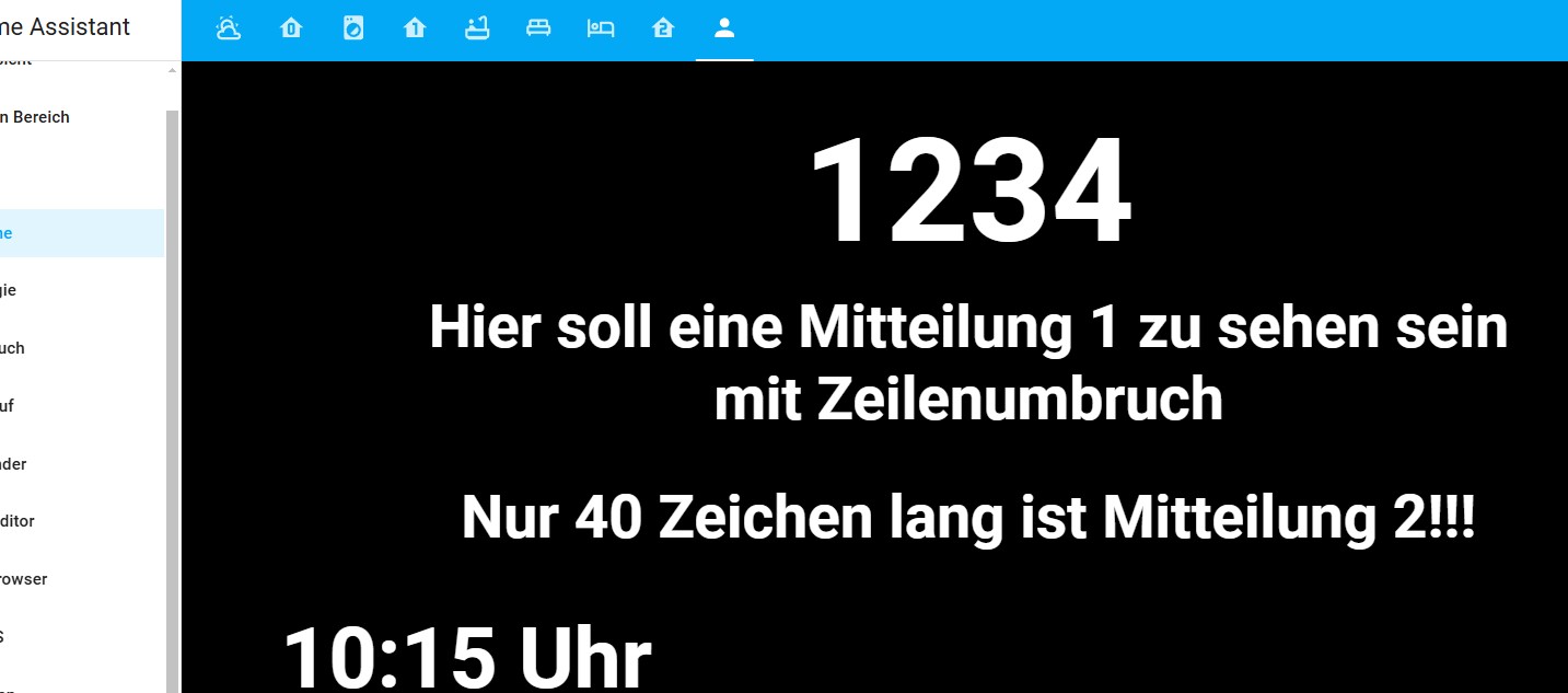
Da mußt Du aber wirklich tricksen.
- neues Dashboard mit schwarzem Hintergrund
- Aufteilung Deiner Vorgaben in Sektionen
- Verwendung von Button-Cards. Hier kannst Du auch große Schrift und viel mit Style Befehlen arbeiten (wie Hintergrund wieder schwarz und große Schrift etc), erfordert aber Einarbeitung.
Ein Hinweis noch zu all den Tricks: Die sind anfällig, daß bei irgendeinem späterem Update sie nicht mehr funktionieren. Ich mache es bei mir dennoch aber negative Überraschungen können kommen.
Hier noch der Dashboard Code
  - title: Forum
    path: forum
    type: sections
    background:
      image: /api/image/serve/c783d4af65bb9412a1cac0ca8a72ae78/original
    max_columns: 3
    icon: mdi:account
    sections:
      - type: grid
        cards:
          - type: custom:button-card
            color_type: label-card
            color: rgb(44, 109, 214)
            name: 1234
            styles:
              card:
                - height: 200px
                - color: white
                - background-color: black
                - font-size: 120px
                - font-weight: bold
            layout_options:
              grid_columns: 12
              grid_rows: 3
          - type: custom:button-card
            color_type: label-card
            color: rgb(44, 109, 214)
            name: Hier soll eine Mitteilung 1 zu sehen sein<br>mit Zeilenumbruch
            styles:
              card:
                - height: 100px
                - color: white
                - background-color: black
                - font-size: 50px
                - font-weight: bold
            layout_options:
              grid_columns: 12
              grid_rows: 2
          - type: custom:button-card
            color_type: label-card
            color: rgb(44, 109, 214)
            name: Nur 40 Zeichen lang ist Mitteilung 2!!!
            styles:
              card:
                - height: 100px
                - color: white
                - background-color: black
                - font-size: 50px
                - font-weight: bold
            layout_options:
              grid_columns: 12
              grid_rows: 2
          - type: custom:button-card
            entity: sensor.uhrzeit_momentan_formatiert_hh_mm
            color_type: label-card
            color: rgb(44, 109, 214)
            show_name: false
            show_state: true
            show_icon: false
            styles:
              card:
                - height: 80px
                - color: white
                - background-color: black
                - font-size: 70px
                - font-weight: bold
        column_span: 3
Gutes Gelingen!