Bitte um Hilfe bei der Apex Chart Card

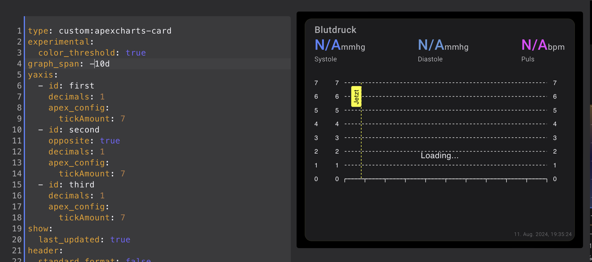
Ich möchte meinen Blutdruck in der Apex Chart Card abbilden. Mit zwei
Y-Achsen komme ich klar, aber hier möchte ich die zwei Y-Achsen nutzen und der Puls soll als “column” dargestellt werden.
Hier mal mein Code:

type: custom:apexcharts-card
experimental:
  color_threshold: true
graph_span: 10d
yaxis:
  - id: first
    decimals: 1
    apex_config:
      tickAmount: 7
  - id: second
    opposite: true
    decimals: 1
    apex_config:
      tickAmount: 7
  - id: third
    decimals: 1
    apex_config:
      tickAmount: 7
show:
  last_updated: true
header:
  standard_format: false
  show: true
  show_states: true
  colorize_states: true
  title: Blutdruck
now:
  show: true
  color: yellow
  label: Jetzt
span:
  start: day
series:
  - entity: sensor.withings_systolischer_blutdruck
    yaxis_id: first
    name: Systole
    type: line
    group_by:
      func: last
      duration: 15m
    stroke_width: 2
    show:
      extremas: true
      header_color_threshold: true
  - entity: sensor.withings_diastolischer_blutdruck
    yaxis_id: second
    name: Diastole
    type: line
    group_by:
      func: last
      duration: 15m
    stroke_width: 2
    show:
      extremas: true
      header_color_threshold: true
  - entity: sensor.withings_herzschlag
    yaxis_id: third
    name: Puls
    type: column
    color: magenta
    opacity: 0.7
    unit: bpm
    group_by:
      func: last
      duration: 1d
      fill: zero

Außerdem verstehe ich gerade nicht warum mir keine Werte aus den letzten Tagen angezeigt werden, denn wenn ich den “Graph_span auf -10d” setzte zeigt er mir ewig nur ein “loading” an.

Wahrscheinlich ist in meinem Code doch einiges falsch. Könnt Ihr mir hier bitte mal weiterhelfen?

Moin,

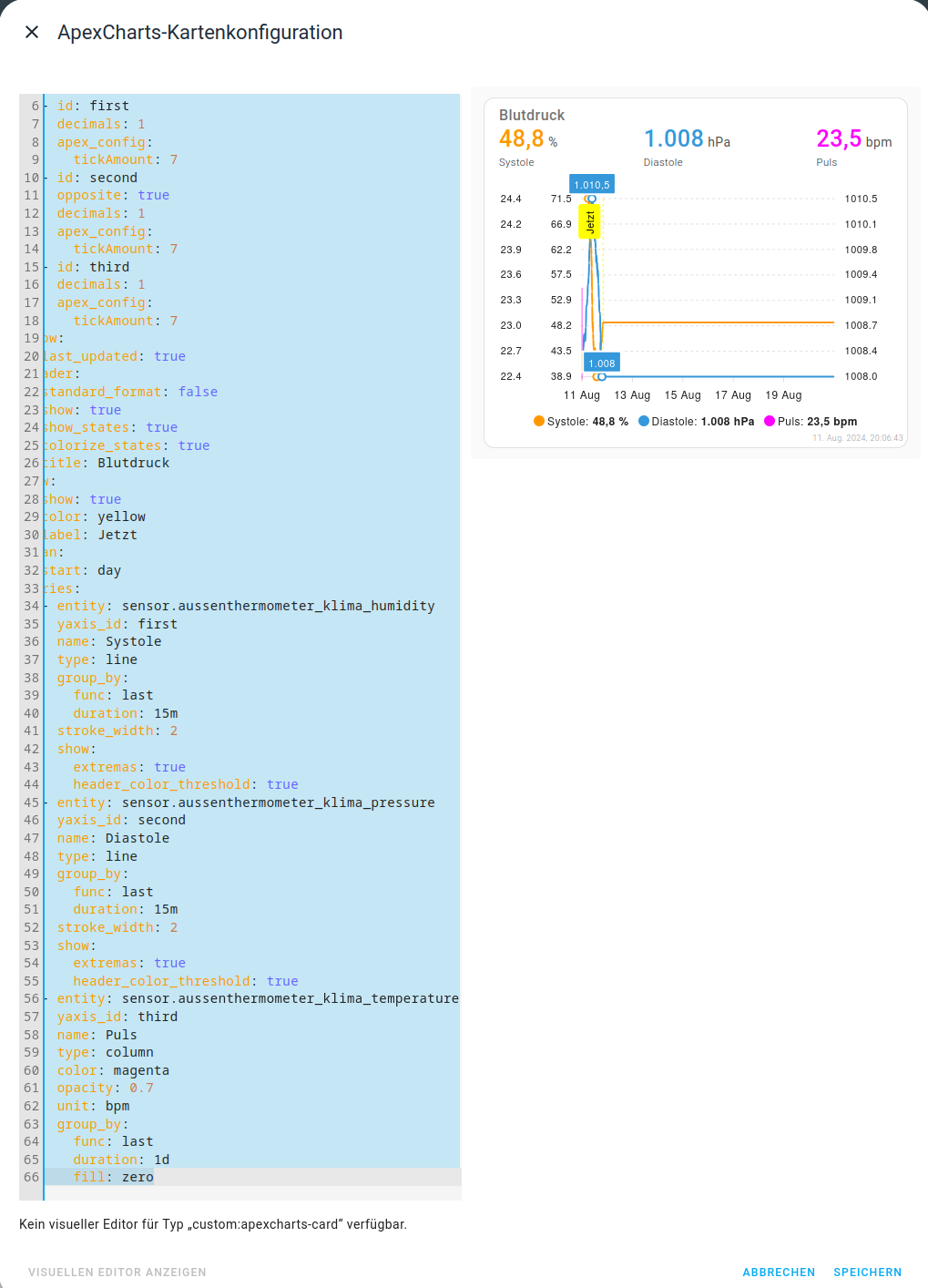
Habe mein Withing gelöscht, daher habe ich Deinen Code mal mit den drei Werten Temperatur, Luftfeuchtigkeit, Luftdruck verbunden, bei mir klappt Dein Code

type: custom:apexcharts-card
experimental:
  color_threshold: true
graph_span: 10d
yaxis:
  - id: first
    decimals: 1
    apex_config:
      tickAmount: 7
  - id: second
    opposite: true
    decimals: 1
    apex_config:
      tickAmount: 7
  - id: third
    decimals: 1
    apex_config:
      tickAmount: 7
show:
  last_updated: true
header:
  standard_format: false
  show: true
  show_states: true
  colorize_states: true
  title: Blutdruck
now:
  show: true
  color: yellow
  label: Jetzt
span:
  start: day
series:
  - entity: sensor.aussenthermometer_klima_humidity
    yaxis_id: first
    name: Systole
    type: line
    group_by:
      func: last
      duration: 15m
    stroke_width: 2
    show:
      extremas: true
      header_color_threshold: true
  - entity: sensor.aussenthermometer_klima_pressure
    yaxis_id: second
    name: Diastole
    type: line
    group_by:
      func: last
      duration: 15m
    stroke_width: 2
    show:
      extremas: true
      header_color_threshold: true
  - entity: sensor.aussenthermometer_klima_temperature
    yaxis_id: third
    name: Puls
    type: column
    color: magenta
    opacity: 0.7
    unit: bpm
    group_by:
      func: last
      duration: 1d
      fill: zero

VG
Bernd

Ich weiß nicht wie ich es genau erklären soll, aber ich versuche es mal:
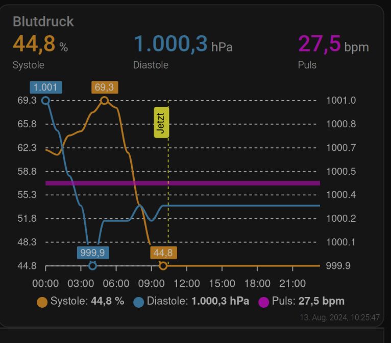
Für die Systole habe ich die linke Y-Achse
Für die Diastole habe ich die rechte Y-Achse

Lediglich den Puls möchte ich nur als column darstellen und da ist wahrscheinlich ein Fehler im Code, denn wenn ich für den 3.Bereich keine Y-Achse auswähle bekomme ich einen Fehler.
Deswegen denke ich das hier etwas falsch ist:

 - entity: sensor.withings_herzschlag
    yaxis_id: third
    name: Puls
    type: column
    color: magenta
    opacity: 0.7
    unit: bpm
    group_by:
      func: last
      duration: 1d
      fill: zero

Moin,

Meine Antwort war in erster Linie dazu da, zu zeigen, dass Dein jetziger Code Werte in dem Chat anzeigt, weil Du ja sagtest, dass da bei Dir nur loading kommt!

Zu Dem zweiten Problem

Nichts falsch, nur noch nicht alles angegeben :slight_smile:

- entity: sensor.withings_herzschlag
    show:
       in_chart: false
    yaxis_id: third
    name: Puls
    #type: column
    color: magenta
    opacity: 0.7
    unit: bpm
    group_by:
      func: last
      duration: 1d
      fill: zero

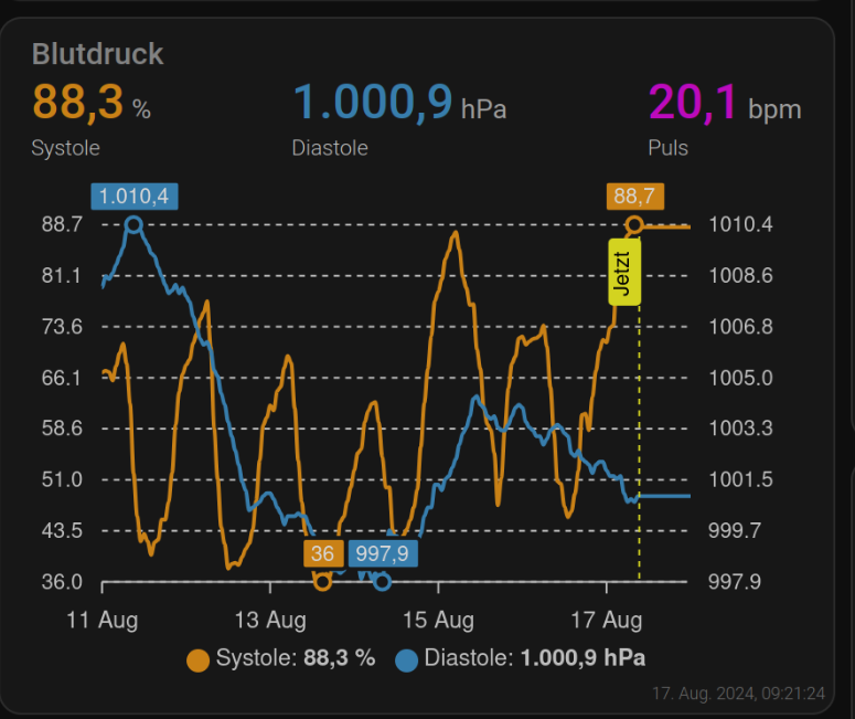
Ich habe es aml mit meinen Wetterdaten so gemacht, wie oben gezeigt
Hier noch mal das ganze, um es besser darzustellen sind die Zeiten angepasst

type: custom:apexcharts-card
experimental:
  color_threshold: true
graph_span: 1d
yaxis:
  - id: first
    decimals: 1
    apex_config:
      tickAmount: 7
  - id: second
    opposite: true
    decimals: 1
    apex_config:
      tickAmount: 7
  - id: third
    decimals: 1
    apex_config:
      tickAmount: 7
show:
  last_updated: true
header:
  standard_format: false
  show: true
  show_states: true
  colorize_states: true
  title: Blutdruck
now:
  show: true
  color: yellow
  label: Jetzt
span:
  start: day
series:
  - entity: sensor.aussenthermometer_klima_humidity
    yaxis_id: first
    name: Systole
    type: line
    group_by:
      func: last
      duration: 1h
    stroke_width: 2
    show:
      extremas: true
      header_color_threshold: true
  - entity: sensor.aussenthermometer_klima_pressure
    yaxis_id: second
    name: Diastole
    type: line
    group_by:
      func: last
      duration: 1h
    stroke_width: 2
    show:
      extremas: true
      header_color_threshold: true
  - entity: sensor.aussenthermometer_klima_temperature
    show:
       in_chart: false
    yaxis_id: third
    name: Puls
    #type: column
    color: magenta
    opacity: 0.7
    unit: bpm
    group_by:
      func: last
      duration: 1d
      fill: zero

grafik

VG
Bernd

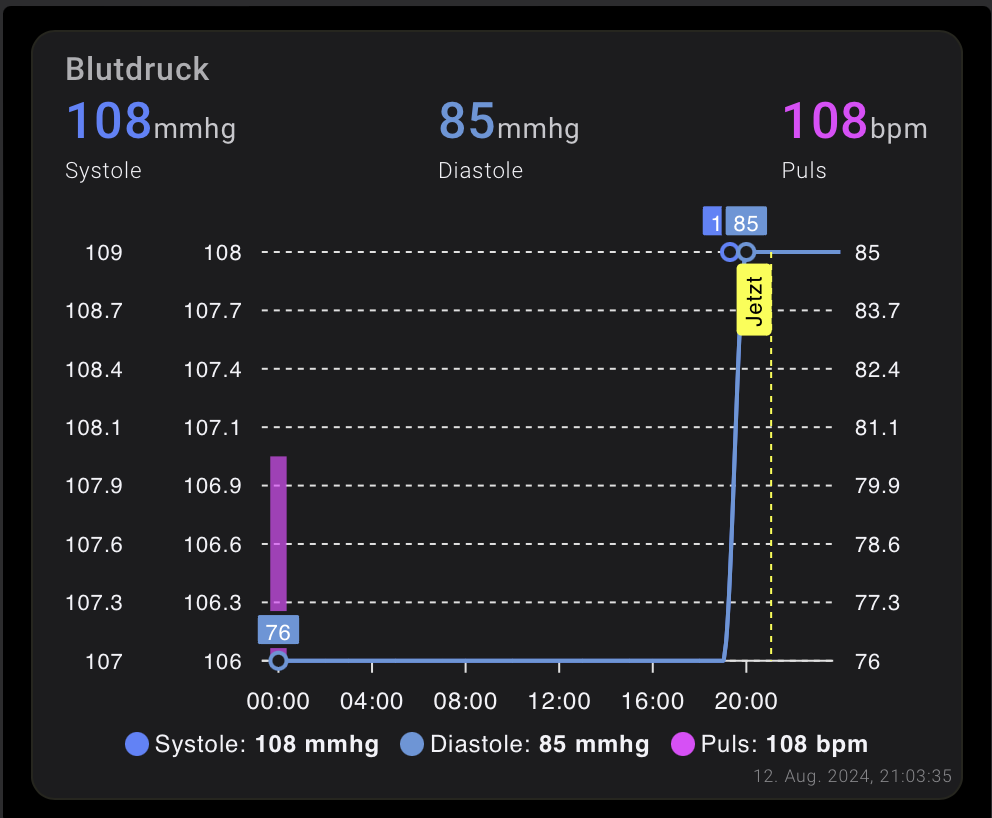
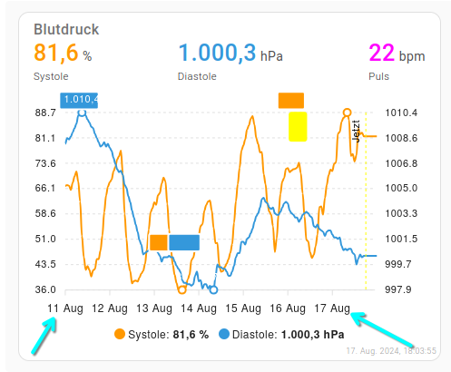
Erstmal danke, aber an einem Punkt hänge ich fest. Ich habe beim Puls den “Type: column” eingefügt, aber wenn ich dann show auf true setze, weil ich die Balken ja sehen möchte, dann wird mir natürlich auch eine dritte Y-Achse eingefügt, welche ich aber nicht möchte. Lässt sich das irgendwie lösen?

 - entity: sensor.withings_herzschlag
    show:
      in_chart: true
    yaxis_id: third
    name: Puls
    type: column
    color: magenta
    opacity: 0.7
    unit: bpm
    group_by:
      func: last
      duration: 1d
      fill: zero

Moin,

Ach, ich war davon ausgegangen, dass Du den Puls nur ob, angezeigt haben wolltest, muss ich dann wohl missverstanden haben.
Dann brauchst Du das

show:
  in_chart: true/false

ja eigentlich nicht, Dir geht es allg. nur darum, dass Du keine y-Achse für Puls haben willst, neh, da habe ich keine Idee.
Beim schnellen Überfliegen der Dokumentation ist mir da schon was aufgefallen, muss ich mir dann mal anschauen, wenn ich am großen Monitor sitze, komme aber erst heute Nachmittag dazu.

VG
Bernd

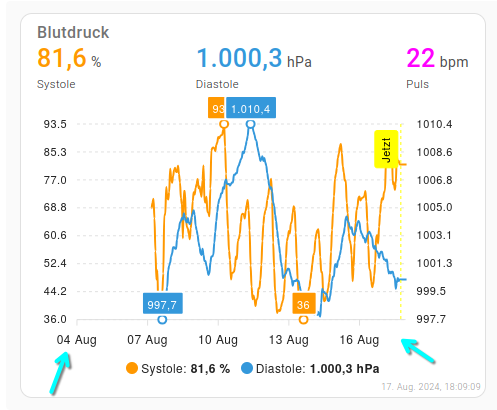
P.S.: habe es jetzt doch schon mal versucht, es sieht jetzt so aus

type: custom:apexcharts-card
experimental:
  color_threshold: true
graph_span: 1d
yaxis:
  - id: first
    decimals: 1
    apex_config:
      tickAmount: 7
  - id: second
    opposite: true
    decimals: 1
    apex_config:
      tickAmount: 7
  - id: third
    show: false
    decimals: 1
    apex_config:
      tickAmount: 7
show:
  last_updated: true
header:
  standard_format: false
  show: true
  show_states: true
  colorize_states: true
  title: Blutdruck
now:
  show: true
  color: yellow
  label: Jetzt
span:
  start: day
series:
  - entity: sensor.aussenthermometer_klima_humidity
    yaxis_id: first
    name: Systole
    type: line
    group_by:
      func: last
      duration: 1h
    stroke_width: 2
    show:
      extremas: true
      header_color_threshold: true
  - entity: sensor.aussenthermometer_klima_pressure
    yaxis_id: second
    name: Diastole
    type: line
    group_by:
      func: last
      duration: 1h
    stroke_width: 2
    show:
      extremas: true
      header_color_threshold: true
  - entity: sensor.aussenthermometer_klima_temperature
    show:
      in_chart: true
    yaxis_id: third
    name: Puls
    color: magenta
    opacity: 0.7
    unit: bpm
    group_by:
      func: last
      duration: 1d
      fill: zero

Ich danke Dir, manchmal kann es so einfach sein. Ich hatte das mittlerweile auch rausgefunden und dann vergessen mich zu melden - sorry!

An einem letzten Punkt hänge ich allerdings fest:
Ich möchte mir die Werte der letzten 7 Tage anzeigen lassen, was bei mir aber nicht klappt. In der Doku steht unter “span Options” folgendes:

Zeigen Sie die letzten 7 Tage an, das Ende der Grafik ist das Ende des aktuellen Tages
type: custom:apexcharts-card
graph_span: 7d
span:
  end: day

Ich habe es auch schon mit “-7d” versucht, aber das klappt irgendwie alles nicht

Moin,

Ja, das ist auch nur die halbe Wahrheit, ich denke, Du hast in Deinem ganzen Code noch ein doppeltes span
Da Du aber Deinen aktuellen Code nicht zeigst, kann ich nur raten, bei Dir irgendwo bei

now:
  show: true
  color: yellow
  label: Jetzt

So sieht das bei meinem Test jetzt aus


Und der Code dazu:

type: custom:apexcharts-card
experimental:
  color_threshold: true
graph_span: 7d
span:
  end: day
yaxis:
  - id: first
    decimals: 1
    apex_config:
      tickAmount: 7
  - id: second
    opposite: true
    decimals: 1
    apex_config:
      tickAmount: 7
  - id: third
    show: false
    decimals: 1
    apex_config:
      tickAmount: 7
show:
  last_updated: true
header:
  standard_format: false
  show: true
  show_states: true
  colorize_states: true
  title: Blutdruck
now:
  show: true
  color: yellow
  label: Jetzt
series:
  - entity: sensor.aussenthermometer_klima_humidity
    yaxis_id: first
    name: Systole
    type: line
    group_by:
      func: last
      duration: 1h
    stroke_width: 2
    show:
      extremas: true
      header_color_threshold: true
  - entity: sensor.aussenthermometer_klima_pressure
    yaxis_id: second
    name: Diastole
    type: line
    group_by:
      func: last
      duration: 1h
    stroke_width: 2
    show:
      extremas: true
      header_color_threshold: true
  - entity: sensor.aussenthermometer_klima_temperature
    show:
      in_chart: true
    yaxis_id: third
    name: Puls
    color: magenta
    opacity: 0.7
    unit: bpm
    group_by:
      func: last
      duration: 1d
      fill: zero

VG
Bernd

Hallo Bernd, mein Code sieht so aus:

type: custom:apexcharts-card
experimental:
  color_threshold: true
graph_span: 1d
yaxis:
  - id: first
    decimals: 1
    apex_config:
      tickAmount: 7
  - id: second
    opposite: true
    decimals: 1
    apex_config:
      tickAmount: 7
  - id: third
    show: false
    decimals: 1
    apex_config:
      tickAmount: 7
show:
  last_updated: true
header:
  standard_format: false
  show: true
  show_states: true
  colorize_states: true
  title: Blutdruck
now:
  show: true
  color: yellow
  label: Jetzt
span:
  start: day
series:
  - entity: sensor.withings_systolischer_blutdruck
    yaxis_id: first
    name: Systole
    type: line
    group_by:
      func: last
      duration: 1h
    stroke_width: 2
    show:
      extremas: true
      header_color_threshold: true
  - entity: sensor.withings_diastolischer_blutdruck
    yaxis_id: second
    name: Diastole
    type: line
    group_by:
      func: last
      duration: 1h
    stroke_width: 2
    show:
      extremas: true
      header_color_threshold: true
  - entity: sensor.withings_herzschlag
    show:
      in_chart: true
    yaxis_id: third
    name: Puls
    type: column
    color: magenta
    opacity: 0.7
    unit: bpm
    group_by:
      func: last
      duration: 1d
      fill: zero

Wenn ich den nun so abändere, sieht es so aus:

type: custom:apexcharts-card
experimental:
  color_threshold: true
graph_span: 7d
span:
  end: day
yaxis:
  - id: first
    decimals: 1
    apex_config:
      tickAmount: 7
  - id: second
    opposite: true
    decimals: 1
    apex_config:
      tickAmount: 7
  - id: third
    show: false
    decimals: 1
    apex_config:
      tickAmount: 7
show:
  last_updated: true
header:
  standard_format: false
  show: true
  show_states: true
  colorize_states: true
  title: Blutdruck
now:
  show: true
  color: yellow
  label: Jetzt
series:
  - entity: sensor.withings_systolischer_blutdruck
    yaxis_id: first
    name: Systole
    type: line
    group_by:
      func: last
      duration: 1h
    stroke_width: 2
    show:
      extremas: true
      header_color_threshold: true
  - entity: sensor.withings_diastolischer_blutdruck
    yaxis_id: second
    name: Diastole
    type: line
    group_by:
      func: last
      duration: 1h
    stroke_width: 2
    show:
      extremas: true
      header_color_threshold: true
  - entity: sensor.withings_herzschlag
    show:
      in_chart: true
    yaxis_id: third
    name: Puls
    type: column
    color: magenta
    opacity: 0.7
    unit: bpm
    group_by:
      func: last
      duration: 1d
      fill: zero

Außerdem geht es mir ja darum die vergangenen 7 Tage anzuzeigen und nicht die kommenden 7 Tage.

Moin,

Ja und, genau das macht mein Code auch!

type: custom:apexcharts-card
experimental:
  color_threshold: true
graph_span: 7d
span:
  end: day

Dann wird das im Diagramm angezeigt
grafik

Wenn ich aber

type: custom:apexcharts-card
experimental:
  color_threshold: true
graph_span: 14d
span:
  end: day

Dann, so
grafik

VG
Bernd

Danke, jetzt geht es bei mir auch.

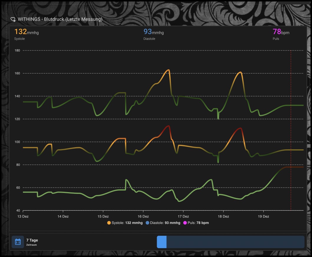
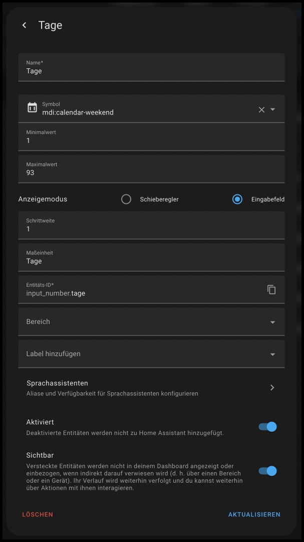
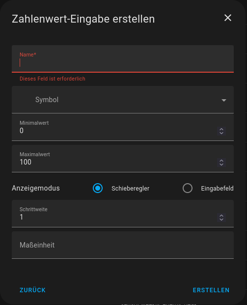
Ich habe noch einen Schieber eingefügt, um die Anzahl der zu zeigenden Tage wählbar zu machen… Wie man das mit graph_span: ${states["input_number.tage"].state +'d'} hinbekommt, hat ein netter Mensch hier aus dem Forum mir vor einiger Zeit gezeigt. Wie klasse ist denn das bitte!

Scheinbar wirkt sich Schlafapnoe heftig auf den Blutdruck aus! :face_vomiting: Termin im Schlaflabor ist gemacht!!!

type: horizontal-stack
cards:
  - type: custom:config-template-card
    entities:
      - input_number.tage
    card:
      type: custom:stack-in-card
      cards:
        - type: custom:apexcharts-card
          experimental:
            color_threshold: true
          graph_span: ${states["input_number.tage"].state +'d'}
          span:
            end: day
          chart_type: line
          header:
            show: true
            title: ""
            show_states: true
            colorize_states: true
          color_list:
            - orange
            - "#3D85C6"
            - magenta
          now:
            show: true
            color: red
            label: ""
          series:
            - entity: sensor.withings_systolischer_blutdruck
              name: Systole
              stroke_width: 4
              color_threshold:
                - value: 120
                  color: "#6AA84F"
                - value: 129
                  color: "#38761D"
                - value: 139
                  color: "#1F3F0F"
                - value: 159
                  color: orange
                - value: 179
                  color: "#990000"
                - value: 180
                  color: darkred
            - entity: sensor.withings_diastolischer_blutdruck
              name: Diastole
              stroke_width: 4
              color_threshold:
                - value: 80
                  color: "#6AA84F"
                - value: 84
                  color: "#38761D"
                - value: 89
                  color: "#1F3F0F"
                - value: 99
                  color: orange
                - value: 109
                  color: "#990000"
                - value: 110
                  color: darkred
            - entity: sensor.withings_herzschlag
              name: Puls
              stroke_width: 4
              color_threshold:
                - value: 66
                  color: "#6AA84F"
                - value: 70
                  color: "#38761D"
                - value: 74
                  color: "#1F3F0F"
                - value: 82
                  color: darkred
        - type: custom:mushroom-number-card
          entity: input_number.tage
          fill_container: false
          layout: horizontal
          primary_info: state
          secondary_info: name
          name: Zeitraum
grid_options:
  columns: full
  rows: auto

Ihr müsst Euch dann nur noch einen numerischen “Helfer” ‘TAGE’ einrichten…

Es ist ein numerischer. Wo man die einrichten kann ist Dir bekannt?

2 „Gefällt mir“

Stimmt, das ist wirklich klasse. Welchen Helfer hast Du für die “Tage” benutzt?

Ich suche schon die ganze Zeit bei “Helfer erstellen”, finde aber keinen der so aussieht wie Deiner. “Nummer” als Helfer wird mir garnicht angezeigt


Moin,

müsste, wenn ich nicht total übermüdet bin, dieser sein


VG
Bernd

P.S.: ich glaube, ich bin doch übermüdet :frowning:
P.P.S.: 'ne doch nicht, obwohl schon seit 4 Uhr auf den Beinen, passt :slight_smile: