Hallo,
ist es möglich, bei einer button card bei tap_action gleich die Attribute eines Sensors anzuzeigen, statt erst die more-info und dann Attribute zeigen zu lassen?
Hallo,
ist es möglich, bei einer button card bei tap_action gleich die Attribute eines Sensors anzuzeigen, statt erst die more-info und dann Attribute zeigen zu lassen?
Suche mal nach popup card. Da kann man pro Gerät den more-info mit beliebigen Dialog überschreiben.
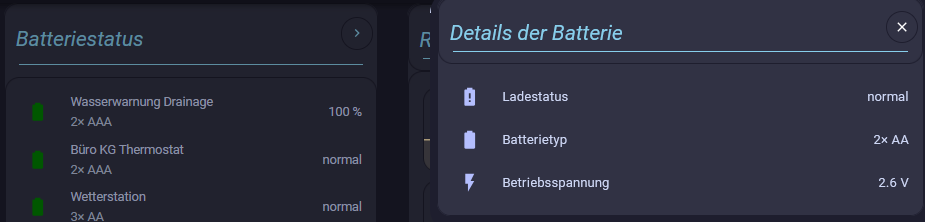
Eine ähnliche Frage hatte ich hier auch schon mal gestellt. Bei mir ging es darum, in einer auto-entities-Karte bei einem Klick bestimmte Attribute der Entität in einem Popup anzeigen zu lassen.
Es ist mir gelungen, nachdem ChatGPT mich auf die Idee gebracht hatte, eine für mich ideale Lösung zu finden und ich veröffentliche sie hier, weil sie richtig gut funktioniert und ihr hoffentlich davon profitieren könnt. (Die Frage taucht ja immer wieder mal auf)
Das Popup kann natürlich auch als tap_action JEDER Karte aktiviert werden.
Um den Code übersichtlicher und wiederverwendbar zu machen, habe ich ihn als decluttering-templates realisiert. Wer das nicht möchte, kann ihn ja aus den Templates kopieren.
Hier das Template des Popups:
  battery_popup_template:
    variables:
      - entity
      - titel
    card:
      type: custom:vertical-stack-in-card
      cards:
        - type: custom:decluttering-card
          template: popup_title_template
          variables:
            - title: '[[titel]]'
          tap_action:
            action: fire-dom-event
            browser_mod:
              service: browser_mod.close_popup
        - type: entities
          entities:
            - type: custom:template-entity-row
              entity: '[[entity]]'
              name: Ladestatus
              state: |
                {% set s = states('[[entity]]') %}
                {% set prozent = '' %}
                {% if s == 'on' %}
                  {% set state = 'niedrig' %}
                {% elif s == 'off' %}
                  {% set state = 'normal' %}
                {% else %}
                  {% set state = s | int(0) %}
                  {% set prozent = '%' %}
                {% endif %}
                {{ state }} {{ prozent }}
            - type: custom:template-entity-row
              name: Batterietyp
              icon: mdi:battery
              state: >
                {% set type =
                states['[[entity]]'].attributes.battery_type_and_quantity
                                      or 'unbekannt' %}
                {{ type }}
            - type: custom:template-entity-row
              name: Betriebsspannung
              icon: mdi:flash
              state: >
                {% set entityId = '[[entity]]' %}

                {% set spannung = 'unbekannt' %}

                {% set unit = '' %}


                {% set name = entityId.split('.')[-1] %}

                {% set s1 =
                name.replace('_battery_plus_low','_betriebsspannung') %}

                {% set s2 = s1.replace('_battery_plus','_betriebsspannung') %}

                {% set spannung_entity = 'sensor.' ~ s2 %}

                {% if states(spannung_entity) not in
                ['unknown','unavailable','none'] %}
                  {% set spannung = states(spannung_entity) %}
                  {% set unit = state_attr(spannung_entity,'unit_of_measurement') %}
                {% endif %}

                {{ spannung }} {{ unit }}
Und so sieht der Titel mit dem Kreuzchen zum Schließen aus:
  popup_title_template:
    card:
      type: custom:vertical-stack-in-card
      cards:
        - type: horizontal-stack
          cards:
            - type: custom:mushroom-title-card
              title: '[[title]]'
              card_mod:
                style: |
                  ha-card {
                    margin-top: 24px !important;
                    margin-bottom: 0px !important;
                    padding-top: 0px !important;
                    padding-bottom: 0px !important;
                    font-style: italic;
                    --title-color: skyblue !important;
                  }
                  h1 {
                    margin: 0 !important;
                    line-height: 1.2 !important;
                  }
            - type: heading
              icon: none
              heading_style: title
              heading: ''
              badges:
                - type: custom:mushroom-template-badge
                  content: ''
                  icon: mdi:close
                  color: white
                  tap_action:
                    action: fire-dom-event
                    browser_mod:
                      service: browser_mod.close_popup
                  hold_action:
                    action: none
                  double_tap_action:
                    action: none
              card_mod:
                style: |
                  ha-card {
                    background: none;
                    box-shadow: none;
                    padding: 0;
                    margin: 0;
                    --icon-size: 20px;
                    color: skyblue;
                    cursor: pointer;
                  }
        - type: entities
          entities:
            - type: divider
              style:
                background-color: skyblue
                height: 1px
          card_mod:
            style: |
              ha-card {
                height: 30px !important;
                margin-top: -10px;
                border: none;
                padding-top: 0px !important;
                padding-bottom: 0px !important;
                background-color: transparent !important;
              }
Der Rest in der Anzeigeinstanz ist dann trivial:
type: custom:decluttering-card
template: battery_template
variables:
  - entity: binary_sensor.wetterstation_battery_plus_low
Und wer das, wie ich, in der auto-entities verwenden möchte, hier zuerst wieder das Template:
  battery_template:
    card:
      type: custom:template-entity-row
      entity: '[[entity]]'
      name: |
        {% set raw_name = state_attr('[[entity]]', 'friendly_name') or '' %}
        {% set clean_name = raw_name
             | replace(' Akku fast leer','')
             | replace(' Batterie','')
             | replace(' Battery','')
             | replace(' level','')
             | replace('+','')
             | trim %}
        {{ clean_name }}
      icon: |
        {% set s = states('[[entity]]') %}
        {% set l = s | int(0) %}
        {% set icon = 'mdi:battery' + {
          l >= 10: '-20',
          l >= 20: '-30',
          l >= 40: '-50',
          l >= 60: '-70',
          l >= 80: '-90',
          s in ['on', 'off'] or l >= 95: '',
        }.get(true, '-outline') %}
        {{ icon }}
      color: |
        {% set s = states('[[entity]]') %}
        {% set color = 'gray' %}
        {% if s == 'on' %}
          {% set color = 'red' %}
        {% elif s == 'off' %}
          {% set color = 'green' %}
        {% else %}
          {% set l = s | int(0) %}
          {% if l < 15 %}
            {% set color = 'red' %}
          {% elif l < 40 %}
            {% set color = 'orange' %}
          {% elif l < 60 %}
            {% set color = 'yellow' %}
          {% else %}
            {% set color = 'green' %}
          {% endif %}
        {% endif %}
        {{ color }}
      state: |
        {% set s = states('[[entity]]') %}
        {% set prozent = '' %}
        {% if s == 'on' %}
          {% set state = 'niedrig' %}
        {% elif s == 'off' %}
          {% set state = 'normal' %}
        {% else %}
          {% set state = s | int(0) %}
          {% set prozent = '%' %}
        {% endif %}
        {{ state }} {{ prozent }}
      secondary: >
        {% set sec = state_attr('[[entity]]', 'battery_type_and_quantity') or
        ''  %}

        {{ sec }}
      tap_action:
        action: fire-dom-event
        browser_mod:
          service: browser_mod.popup
          data:
            content:
              type: custom:decluttering-card
              template: battery_popup_template
              variables:
                - entity: '[[entity]]'
                - titel: Details der Batterie
Und die auto-entities-Karte:
  - type: custom:auto-entities
    card:
      type: entities
      style: |
        ha-card {
          border: none !important;
          border-radius: 0 !important;
          padding: 0 !important;
          margin: 0 !important;
          box-shadow: none !important;
        }
    filter:
      template: |-
        [
          {% for e in state_attr('sensor.battery_plus_devices', 'entities') %}
            {
              "type": "custom:decluttering-card",
              "template": "battery_template",
              "variables": [ { "entity": "{{ e }}" } ]
            }{% if not loop.last %},{% endif %}
          {% endfor %}
        ]
    card_mod:
      style:
        .: |
          ha-card {
            border: none !important;
            padding: 0px !important;
           }
Und so sieht es dann aus:
Ich denke, es ist nicht schwer, das auf andere Anwendungsfälle zu portieren.