Hi!
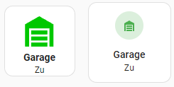
Hier komme ich nicht weiter…ich möchte den ausgegebenen Status von “Geschlossen” auf “Zu” ändern.
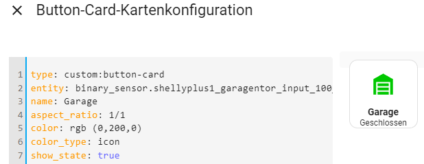
type: custom:button-card
entity: binary_sensor.shellyplus1_garagentor_input_100_input
name: Garage
aspect_ratio: 1/1
color: rgb (0,200,0)
color_type: icon
show_state: true
size: 50%
state:
  - color: rgb(0,200,0)
    icon: mdi:garage
    value: 'off'
  - color: rgb(255,0,0)
    icon: mdi:garage-open
    styles:
      icon:
        - animation: blink 2s ease infinite
    value: 'on'
tap_action:
  action: call-service
  service: switch.turn_on
  data:
    entity_id: switch.shellyplus1_garagentor_switch_0
styles:
  card:
    - height: 100px
    - width: 100px
  name:
    - justify-self: center
    - font-weight: bold
    - font-size: 14px
  state:
    - justify-self: center
    - font-size: 12px
Ich hab schon etliches ausprobiert, komm aber nicht drauf, wo im code ich nun den gewünschten Status eintragen muss.
Danke!
Hi, Nein, das ist nicht möglich. Es gibt keine Möglichkeit, den Schalterstatus zu ändern. Ich habe das via custom_fields gelöst. show_state kannst du dann auf false setzen. Guck dir mal die Beispiele zum Thema custom_fields an.
Bsp:
custom_fields:
  cf2: |
    [[[
    var espresso = states['input_boolean.xyz'].state;
    if (espresso == "on") {
        return "Auf";
    } else {
        return "Zu";
    }

    ]]]
1 „Gefällt mir“
Danke dir!
type: custom:button-card
entity: binary_sensor.shellyplus1_garagentor_input_100_input
name: Garage
aspect_ratio: 1/1
color: rgb (0,200,0)
color_type: icon
show_state: false
size: 50%
state:
  - color: rgb(0,200,0)
    icon: mdi:garage
    value: 'off'
  - color: rgb(255,0,0)
    icon: mdi:garage-open
    styles:
      icon:
        - animation: blink 2s ease infinite
    value: 'on'
tap_action:
  action: call-service
  service: switch.turn_on
  data:
    entity_id: switch.shellyplus1_garagentor_switch_0
styles:
  icon:
    - width: 70%
    - margin-top: -30%
  card:
    - height: 100px
    - width: 100px
  name:
    - font-weight: bold
    - font-size: 14px
    - position: absolute
    - top: 65%
    - height: 20px
    - text-align: center
  state:
    - justify-self: center
    - font-size: 12px
  custom_fields:
    cf2:
      - justify-self: center
      - position: absolute
      - top: 85%
      - height: 20px
      - font-size: 12px
      - text-align: center
custom_fields:
  cf2: >
    [[[
    var tor =
    states['binary_sensor.shellyplus1_garagentor_input_100_input'].state;
    if (tor == "off") {
        return "Zu";
    } else {
        return "Offen";
    }
    ]]]
Hier im Vergleich der code für die mushroom-card:
          - type: custom:mushroom-template-card
            primary: Garage
            secondary: >-
              {% if
              is_state('binary_sensor.shellyplus1_garagentor_input_100_input',
              'off') %}
                Zu
              {% else %}
                Offen
              {% endif %}
            icon: >-
              {% if
              is_state('binary_sensor.shellyplus1_garagentor_input_100_input',
              'off') %}
                mdi:garage
              {% else %}
                mdi:garage-open
              {% endif %}
            icon_color: >-
              {% if
              is_state('binary_sensor.shellyplus1_garagentor_input_100_input',
              'off') %}
                green
              {% else %}
                red
              {% endif %}
            entity: binary_sensor.shellyplus1_garagentor_input_100_input
            layout: vertical
            fill_container: false
            double_tap_action:
              action: call-service
              service: switch.turn_on
              target:
                entity_id: switch.shellyplus1_garagentor_switch_0
              data: {}
            multiline_secondary: false
ja das ist richtig. Der Vorteil des Ganzen ist aber, dass du dir ein template anlegen kannst und diese dann direkt in der Card aufrufst via
template:
  - name_deines_tenplate
So kannst du das dann für jede Karte verwenden und musst cf2 nicht ständig neu definieren.
1 „Gefällt mir“
Bolschi:
template anlegen kannst
Das klingt interessant, hast du da auf die schnelle eine Anleitung/Link für Dummies, wo ich was genau definieren muss und wie ich das in den Karten einsetzen kann?
Hi ok,vor views: Hier kannst du alles festlegen was deine Kartenoptik/Grid (Aufteilung) etc betrifft:
button_card_templates:
  default_button_gesamt_ansicht:
    show_state: true
    show_label: true
    aspect_ratio: 1/1
    size: 70%
    tap_action:
      action: toggle
      haptic: medium
    hold_action:
      action: more-info
      haptic: heavy
    double_tap_action:
      action: more-info
      haptic: heavy
    styles:
      card:
        - border-radius: 5%
        - filter: opacity(90%)
        - border: none
      custom_fields:
        cf1:
          - justify-self: start
          - margin-left: 8%
          - padding-bottom: 0%
          - font-size: 9pt
          - color: var(--secondary-text-color)
        cf2:
          - justify-self: start
          - margin-left: 8%
          - padding-bottom: 5%
          - font-size: 9pt
          - color: var(--secondary-text-color)
        cf3:
          - justify-self: start
          - margin-left: 8%
          - padding-bottom: 5%
          - font-size: 9pt
          - color: '#fff'
        cf4:
          - justify-self: start
          - margin-left: 8%
          - padding-bottom: 5%
          - font-size: 9pt
          - color: '#2f2f2f'
        cf5:
          - color: '#000'
          - icon: ios:moon-stars-fill
      grid:
        - grid-template-areas: '"i l" "n n" "s s" "cf1 cf1" "cf2 cf2" "cf3 cf3" "cf4 cf4" "cf5 cf5"'
        - grid-template-columns: 1fr 1fr
        - grid-template-rows: 1fr auto auto auto
      label:
        - justify-self: start
        - font-size: 11pt
      name:
        - justify-self: start
        - margin-left: 8%
        - font-size: 12pt
        - font-weight: 700
      state:
        - justify-self: start
        - margin-left: 8%
        - font-size: 9pt
  default_button_status_ist_aus:
    state:
      - styles:
          state:
            - color: blue
        value: unavailable
      - styles:
          color: '#9e9e9e'
          custom_fields:
            cf1:
              - color: var(--secondary-text-color)
              - opacity: 0.3
            cf2:
              - color: '#fff'
              - opacity: 0.3
          icon:
            - color: '#9d9d9d'
            - opacity: 0.3
          card:
            - background: rgba(255, 255, 255,  .08)
          label:
            - opacity: 0.3
          name:
            - opacity: 0.3
          state:
            - color: var(--secondary-text-color)
            - opacity: 0.3
        value: 'off'
        id: state_off
  default_button_status_ist_an:
    state:
      - styles:
          card:
            - background-color: white
            - filter: opacity(70%)
          custom_fields:
            cf1:
              - color: '#555'
            cf2:
              - color: '#555'
          label:
            - color: '#555'
            - font-size: 11pt
          name:
            - color: '#171717'
          state:
            - color: '#555'
          icon:
            - color: '#555'
        value: 'on'
        id: state_on
  licht_button:
    state:
      - styles:
          icon:
            - color: '#e7c51d'
        value: 'on'
        id: state_on
    double_tap_action:
      action: more-info
    show_label: true
    show_state: true
    state_display: |
      [[[
        var hell = entity.attributes.brightness;
        var hell_rounded = Math.round(entity.attributes.brightness / 2.55);
        if (entity.state == "on" && hell !== undefined) return "Licht " + hell_rounded + "%";
        else return ""
      ]]]
    tap_action:
      action: toggle
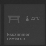
Nun kannst du in deiner custom-button Card die Templates ansprechen
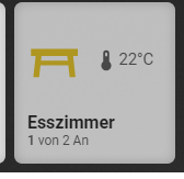
type: custom:button-card
entity: light.lichtgruppe_esszimmer
name: Esszimmer
friendly_name: true
state_color: true
show_state: false
template:
  - licht_button
  - default_button_status_ist_an
  - default_button_status_ist_aus
  - default_button_gesamt_ansicht
icon: |
  [[[
  var licht = states['light.lichtgruppe_esszimmer_ha'].state;
  return (licht == "on") ? 'mdi:table-furniture' : 'mdi:table-furniture';

  ]]]
label: >
  [[[

  var temperature =
  Math.round(states['sensor.thermostat_aqara_wohnzimmer_temperature'].state);

  return `<ha-icon
            icon="mdi:thermometer"
            style="width: 22px; height: 22px;"></ha-icon><span>${temperature}°C</span>`;

  ]]]
custom_fields:
  cf2: |
    [[[
    var licht= states['light.lichtgruppe_esszimmer_ha'].state;
    var anzahl = states['sensor.anzahl_essen_lichter_an'].state;
    var gesamt = states['sensor.gesamt_anzahl_lampen_gruppe_essen'].state;
    if (licht == "on") {
      return "<b>" + anzahl + "</b>" + " von " + gesamt + " An";
    } else {
      return "Licht ist aus";
    }

    ]]]

styles:
  card:
    - box-shadow: inset 0px 0px 10px 0px rgba(0, 0, 0, .2);
tap_action:
  haptic: heavy
  action: navigate
  navigation_path: /lovelace-tablet/esszimmer
hold_action:
  action: toggle
Der Schalter gefällt mir sehr gut, ich habe das Template und den Schalter kopiert und er funktioniert sehr gut. Was ich aber nicht schaffe ist die Hintergrundfarbe und die Icon Farbe zu ändern.
na da ist doch schon in dem entsprechenden Template drin bsp: im Template
  default_button_status_ist_an:
    state:
      - styles:
          card:
            - background-color: white
            - filter: opacity(70%)
oder du gibst es direkt in deiner button-card mit bsp:
state:
  - value: on
    icon: ios:trash
    name: Bio
    label: "ein Text"
    styles:
      card:
        - background: rgb(125, 160, 20)
      name:
        - font-size: 15px
        - color: '#000'
      icon:
        - color: '#000'
  - value: of
    icon: ios:trash
    name: Papier
    label: "noch ein Text"
    styles:
      card:
        - background: rgb(0, 128, 183)
      name:
        - font-size: 15px
        - color: '#000'
      icon:
        - color: '#000'
Danke für die ausführliche Antwort und das Beispiel. das hat mit weitergeholfen.