Hallo zusammen,
wer interesse hat mal die Rollos in Home Assistant mit einer Bubble-Card und NICHT als Cover-Card sondern als Slider darzustellen habe ich hier eine Hilfe für euch.
Die Idee stammt nicht von mir. Ich bin da sogar hier im Forum mal aufmerksam drauf geworden. Das wurde aber eher nebenbei in einem Thema erwähnt und ich finde es auch nicht wieder. Möchte mich hier also auch nicht unnötigerweise mit fremden Federn schmücken.
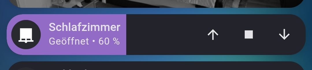
Verwendet wird also ein Bubble-Card für Cover aber vom Typ Slider. Die Knöpfe für Schließen, Stoppen und Öffnen sind Sub-Buttons.
So sieht das bei mir aus:
Hier mal ein Kartenbeispiel:
Zusammenfassung
type: custom:bubble-card
card_type: button
button_type: slider
entity: cover.shelly_buro_2
force_icon: false
show_state: true
show_last_changed: false
show_attribute: true
attribute: current_position
min_value: 0
sub_button:
  - entity: cover.shelly_buro_2
    icon: mdi:arrow-down-bold
    state_background: true
    show_background: false
    tap_action:
      action: perform-action
      perform_action: cover.close_cover
      target:
        entity_id: cover.shelly_buro_2
      data: {}
  - entity: cover.shelly_buro_2
    icon: mdi:stop
    tap_action:
      action: perform-action
      perform_action: cover.stop_cover
      target:
        entity_id: cover.shelly_buro_2
      data: {}
    show_background: false
  - entity: cover.shelly_buro_2
    icon: mdi:arrow-up-bold
    tap_action:
      action: perform-action
      perform_action: cover.open_cover
      target:
        entity_id: cover.shelly_buro_2
      data: {}
    show_background: false
card_layout: normal
styles: ""
show_icon: true
show_name: true
button_action:
  tap_action:
    action: none
  hold_action:
    action: none
slider_live_update: false
modules:
  - jalousien_slider
Das wäre der Code fürs Styling:
Zusammenfassung
/* ändert das Haupt-Icon (Links)je nach Zustand */
${icon.setAttribute(
    "icon",
        hass.states[entity].attributes.current_position < 1 ? 'mdi:window-shutter' :
        hass.states[entity].attributes.current_position > 99 ? 'mdi:window-shutter-open' :
        'mdi:window-shutter-alert'
)}

/* Hintergrundfarbe der Bubble, wenn das Cover geschlossen oder teil-geschlossen ist.
Außerdem die Angabe des Hintergrundbild, falls gewünscht */
.bubble-container {
  background: #282828 url(/local/bg_img/cover_bg4.png) repeat-x !important;
}

/* Füll-Farbe des Slider */
.bubble-range-fill {
  background-color: rgba(23, 52, 95, 1) !important;
}

/* Haupt-Icon-Container (Links). Hintergrund abhängig von der Position des Cover */
.bubble-icon-container {
  background-color: ${
      hass.states[entity].attributes.current_position < 1 ? '#525252' :
      '#22497f'
  } !important;
}

/* Haupt-Icon (Links). Farbe je nach Position des Cover */
.bubble-icon {
  color: ${
      hass.states[entity].attributes.current_position > 99 ? '#e1e1e1' :
      hass.states[entity].attributes.current_position < 1 ? '#909090' :
      'rgba(9, 23, 42, 1)'
  } !important;
  opacity: 1;
}

/* Grundkonfiguration für alle Sub-Buttons. Farben nach Zustand opening und closing */
.bubble-sub-button {
  color: ${
      state === 'opening' ? 'rgba(225, 225, 225, 1)' :
      state === 'closing' ? 'rgba(225, 225, 225, 1)' :
      'rgba(225, 225, 225, 0.2)'
  };
  background-color: ${
      state === 'opening' ? 'rgba(18, 40, 72, 1)' :
      state === 'closing' ? 'rgba(18, 40, 72, 1)' :
      'rgba(18, 40, 72, 0.6)'
  };
  width: 45px;
  border: 1px solid rgba(225, 225, 225, 0.1);

}

/* Sub-Button für Schließen. Button bekommt angepasste Alpha-Transparenz wenn "Status closing nicht möglich", weil Position === 0 also vollständig geschlossen
Hier kann auch alternativ auf state "closed" geprüft werden */
.bubble-sub-button-1 {
  background-color: ${
      hass.states[entity].attributes.current_position === 0 ? 'rgba(18, 40, 72, 0.6)' :
      'rgba(18, 40, 72, 1)'
  } !important;
  color: ${
      hass.states[entity].attributes.current_position === 0 ? 'rgba(225, 225, 225, 0.2)' :
      'rgba(225, 225, 225, 1)'
  } !important;
  border-top-right-radius: 3px;
  border-bottom-right-radius: 3px;
  margin: 0 -3px 0 0;
  padding: 0 0 0 1px;
}

/* Sub-Button für Stoppen bzw. Pause. Button bekommt angepasste Alpha-Transparenz wenn "nicht" Status "closing" oder "opening" vorliegt (Pause oder Stoppen ist dann nicht möglich. Konfiguration siehe Sub-Button 1 */
.bubble-sub-button-2 {
  border-radius: 3px;
  width: 40px;
}

/* Sub-Button für Öffnen. Button bekommt angepasste Alpha-Transparenz wenn "Status "opening"" nicht möglich", weil Position === 100 also vollständig geöffnet
Hier kann auch alternativ auf state "open" geprüft werden */
.bubble-sub-button-3 {
  background-color: ${
      hass.states[entity].attributes.current_position === 100 ? 'rgba(18, 40, 72, 0.6)' :
      'rgba(18, 40, 72, 1)'
  } !important;
  color: ${
      hass.states[entity].attributes.current_position === 100 ? 'rgba(225, 225, 225, 0.2)' :
      'rgba(225, 225, 225, 1)'
  } !important;
  border-top-left-radius: 3px;
  border-bottom-left-radius: 3px;
  margin: 0 0 0 -3px;
  padding: 0 1px 0 0;
}
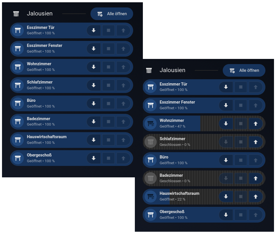
Ich würde jedem empfehlen das nicht im Feld “Styling options / Custom styles & JS templates” einzufügen. Das funktioniert zwar, in aller Regel hat man aber doch mehrere Jalousien in seinem Haushalt. Wenn man das in jeder Bubble-Card separat einfügt hat man bei Änderungen irgend wann ein Maintain-Problem und es bläht den Code eigentlich nur unnötig auf.
Die Bubble-Card hat dafür die Module. Besser ist es also ein eigenes Modul dafür zu erstellen und dieses jeweils der Cover-Karten zuzuweisen.
Zum besseren Verständnis habe ich den Code entsprechend Kommentiert.
Das Background für den Bubble-Container liegt bei mir im Ordner ../www/img_bg/ und wird mittels /local/bg_img/ angesprochen.
Das ist die Datei (die ist sehr Transparent (nur4%)→ schlecht sichtbar bei hellem Forum Hintergrund. eventuell auf dark-Mode umschalten, oder selbst eine Grafik erstellen):
Was ich noch nicht hinbekommen habe und eigentlich umsetzen wollte, ist dass die Sub-Buttons für Schließen, Stoppen und Öffnen nur klickbar werden, wenn eine entsprechende Action überhaupt möglich ist. Wer da Ideen hat… You are welcome 
Für Anregungen bin ich natürlich immer offen 