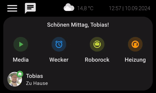
Slider Card richtig anwenden

Guten Morgen,

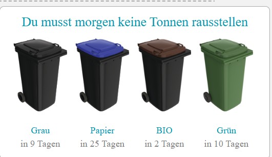
ich bin dabei eine Slider Card auf meinem Dashboard einzurichten. Ich bekomme es aber einfach nicht hin. Folgende Karte möchte ich im Wechsel (automatisch) mit einer Wetterkarte anzeigen lassen. Mein Problem ist, dass die erste Karte (Mülleimer) sich auch aus mehreren Karten darstellt.

Screenshot 2024-09-10 123954

Der Code dazu:

type: picture-elements
image: /local/muell/Back_trans.png
elements:
  - type: custom:button-card
    entity: sensor.mullabholung_text_morgen
    show_icon: false
    show_name: false
    show_state: true
    style:
      top: 10%
      left: 50%
      width: 100%
    styles:
      state:
        - font-size: 1vw
        - font-family: Arial Rounded MT
        - color: var(--primary-color)
        - white-space: unset
        - text-overflow: unset
        - word-break: break-word
      card:
        - background: transparent
        - border: none
  - type: custom:button-card
    entity: sensor.grau
    show_entity_picture: true
    entity_picture: /local/muell/schwarz.png
    show_state: false
    show_name: false
    aspect_ratio: 2/3
    size: 100%
    styles:
      card:
        - border: none
        - background: transparent
    state:
      - value: Morgen
        entity_picture: /local/muell/schwarz.png
        styles:
          entity_picture:
            - animation:
                - blink 1s linear infinite
    style:
      pointer-events: none
      left: 15%
      top: 45%
      width: 20%
  - type: custom:button-card
    entity: sensor.papier
    show_entity_picture: true
    entity_picture: /local/muell/blau.png
    show_state: false
    show_name: false
    aspect_ratio: 2/3
    size: 100%
    styles:
      card:
        - border: none
        - background: transparent
    state:
      - value: Morgen
        entity_picture: /local/muell/blau.png
        styles:
          entity_picture:
            - animation:
                - blink 1s linear infinite
    style:
      pointer-events: none
      left: 38%
      top: 45%
      width: 20%
  - type: custom:button-card
    entity: sensor.bio
    show_entity_picture: true
    entity_picture: /local/muell/braun.png
    show_state: false
    show_name: false
    aspect_ratio: 2/3
    size: 100%
    styles:
      card:
        - border: none
        - background: transparent
    state:
      - value: Morgen
        entity_picture: /local/muell/braun.png
        styles:
          entity_picture:
            - animation:
                - blink 1s linear infinite
    style:
      pointer-events: none
      left: 61%
      top: 45%
      width: 20%
  - type: custom:button-card
    entity: sensor.grun
    show_entity_picture: true
    entity_picture: /local/muell/gruen.png
    show_state: false
    show_name: false
    aspect_ratio: 2/3
    size: 100%
    styles:
      card:
        - border: none
        - background: transparent
    state:
      - value: Morgen
        entity_picture: /local/muell/gruen.png
        styles:
          entity_picture:
            - animation:
                - blink 1s linear infinite
    style:
      pointer-events: none
      left: 84%
      top: 45%
      width: 20%
  - type: custom:button-card
    entity: sensor.grau
    show_name: true
    show_icon: false
    show_state: true
    style:
      top: 85%
      left: 15%
      width: 25%
    styles:
      name:
        - font-size: 0,9vw
        - font-family: Arial Rounded MT
        - color: var(--primary-color)
      state:
        - font-size: 0,8vw
        - font-family: Arial Rounded MT
        - padding-top: 0.3em
      card:
        - background-color: transparent
        - border: none
  - type: custom:button-card
    entity: sensor.papier
    show_name: true
    show_icon: false
    show_state: true
    style:
      top: 85%
      left: 38%
      width: 25%
    styles:
      name:
        - font-size: 0,9vw
        - font-family: Arial Rounded MT
        - color: var(--primary-color)
      state:
        - font-size: 0,8vw
        - font-family: Arial Rounded MT
        - padding-top: 0.3em
      card:
        - background-color: transparent
        - border: none
  - type: custom:button-card
    entity: sensor.bio
    show_name: true
    show_icon: false
    show_state: true
    style:
      top: 85%
      left: 61%
      width: 25%
    styles:
      name:
        - font-size: 0,9vw
        - font-family: Arial Rounded MT
        - color: var(--primary-color)
      state:
        - font-size: 0,8vw
        - font-family: Arial Rounded MT
        - padding-top: 0.3em
      card:
        - background-color: transparent
        - border: none
  - type: custom:button-card
    entity: sensor.grun
    show_name: true
    show_icon: false
    show_state: true
    style:
      top: 85%
      left: 84%
      width: 25%
    styles:
      name:
        - font-size: 0,9vw
        - font-family: Arial Rounded MT
        - color: var(--primary-color)
      state:
        - font-size: 0,8vw
        - font-family: Arial Rounded MT
        - padding-top: 0.3em
      card:
        - background-color: transparent
        - border: none

Moin,
ich habe bei mir die swipe-card im Einsatz, hier mal ein gif:
swipe-card

Hier der Code für die komplette Karte im gif.
type: custom:vertical-stack-in-card
cards:
  - type: custom:mushroom-template-card
    primary: |-
      {% set time = now().hour %}
      {% if (time >= 22) %}
        Gute Nacht, {{user}}!
      {% elif (time >= 18) %}
        Guten Abend, {{user}}!
      {% elif (time >= 13) %}
        Schönen Nachmittag, {{user}}!
      {% elif (time >= 12) %}
        Schönen Mittag, {{user}}!
      {% elif (time >= 5) %}
        Guten Morgen, {{user}}!
      {% else %}
        Hallo, {{user}}!
      {% endif %}
    multiline_secondary: false
    layout: vertical
    double_tap_action:
      action: none
    tap_action:
      action: none
    hold_action:
      action: none
  - type: custom:swipe-card
    parameters:
      autoplay:
        delay: 5000
    cards:
      - type: grid
        square: false
        columns: 4
        cards:
          - type: custom:mushroom-template-card
            primary: Media
            icon: mdi:play
            layout: vertical
            tap_action:
              action: navigate
              navigation_path: media
            icon_color: green
            card_mod:
              style: |
                ha-card {
                  box-shadow: none;
                }
          - type: custom:mushroom-template-card
            primary: Wecker
            icon: mdi:alarm
            layout: vertical
            tap_action:
              action: navigate
              navigation_path: wecker
            icon_color: blue
            card_mod:
              style: |
                ha-card {
                  box-shadow: none;
                }
          - type: custom:mushroom-template-card
            primary: Roborock
            icon: mdi:robot-vacuum
            layout: vertical
            icon_color: lime
            tap_action:
              action: navigate
              navigation_path: roborock
            card_mod:
              style: |
                ha-card {
                  box-shadow: none;
                }
          - type: custom:mushroom-template-card
            primary: Heizung
            icon: mdi:thermostat
            layout: vertical
            icon_color: orange
            tap_action:
              action: navigate
              navigation_path: heizung
            card_mod:
              style: |
                ha-card {
                  box-shadow: none;
                }
      - type: grid
        square: false
        columns: 4
        cards:
          - type: custom:mushroom-template-card
            primary: Netzwerk
            icon: mdi:network
            layout: vertical
            icon_color: yellow
            tap_action:
              action: navigate
              navigation_path: netzwerk
            card_mod:
              style: |
                ha-card {
                  box-shadow: none;
                }
          - type: custom:mushroom-template-card
            primary: Batterie
            icon: mdi:battery-60
            layout: vertical
            icon_color: blue
            tap_action:
              action: navigate
              navigation_path: batterie
            card_mod:
              style: |
                ha-card {
                  box-shadow: none;
                }
          - type: custom:mushroom-template-card
            primary: Strom
            icon: mdi:home-lightning-bolt
            layout: vertical
            icon_color: purple
            tap_action:
              action: navigate
              navigation_path: strom
            card_mod:
              style: |
                ha-card {
                  box-shadow: none;
                }
          - type: custom:mushroom-template-card
            primary: Admin
            icon: mdi:cog
            layout: vertical
            tap_action:
              action: navigate
              navigation_path: admin
            icon_color: red
            card_mod:
              style: |
                ha-card {
                  box-shadow: none;
                }
  - type: grid
    square: false
    columns: 2
    cards:
      - type: custom:mushroom-person-card
        entity: person.tobias
        double_tap_action:
          action: navigate
          navigation_path: tobi
        icon_type: entity-picture

Ich denke das du sowas als Slider-Card meinst, da du nichts verlinkt hast.

habe extra für dich bei mir kurz autoplay mit eingebaut:

    parameters:
      autoplay:
        delay: 5000

Ich habe bei mir alle Karten die zusammen wechsel sollen jeweils in einem grid, man könnte natürlich auch eine Horizontalem- und/oder Verticalen-Stapel arbeiten bzw. du hast es ja schon in einer picture elements Karte.

Vielleicht hilft dir das ja schon für die Umsetzung

LG
Tobi

1 „Gefällt mir“